
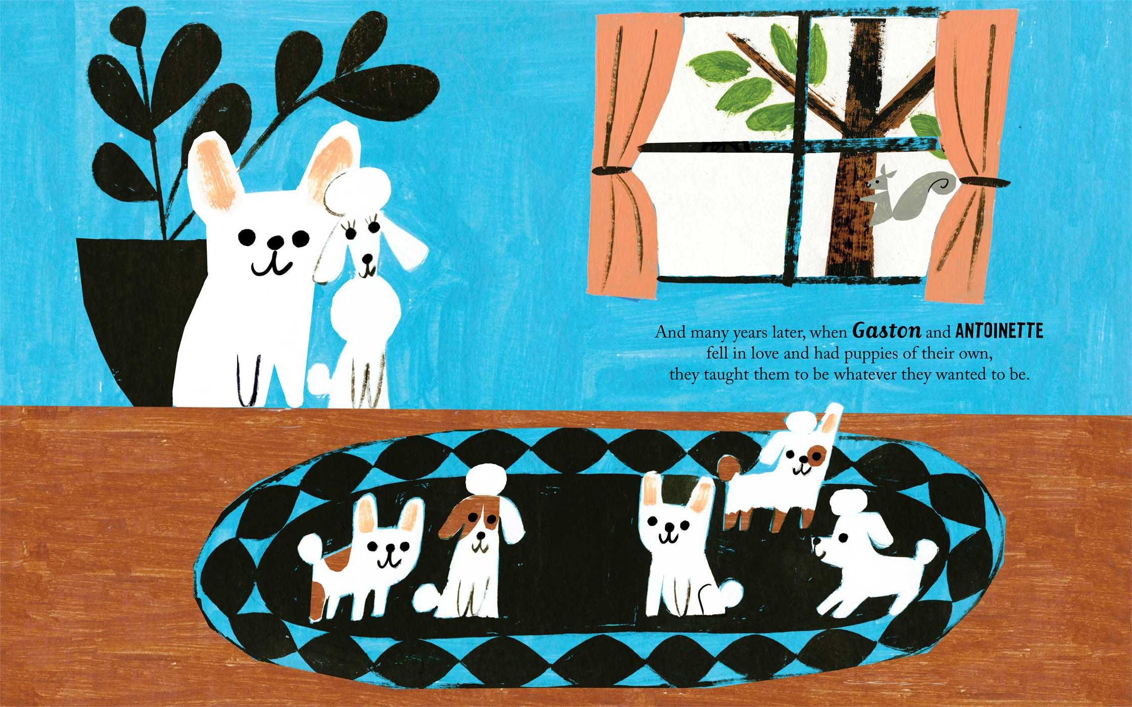
Robinson's tone of voice feels very reminiscent of mid-century illustration. I am particularly fond of his use of negative space as a tool of shape, and the simple but bold colour choices. The heavy use of black in the lower image could be overpowering but is used in a way that brings out the other colours. It also works as a tool to move the eye around the composition.
Whilst I very much admire this use of shape and colour I think what I like most about it is the natural textures that come through with the use of paint. Otherwise it could look very flat, and I realise that this would be the result if he had used Adobe Illustrator too!
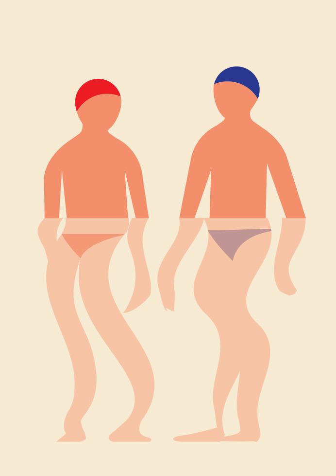
I suppose it is ok to embrace the simple perfections of the software, for example, more like Robert Bailey. But it is not impossible to create wacky and fluid shapes in the programme, as seen in J.Otto Seibold's storybooks.
Robert Bailey: Above and Below

J.Otto Seibold: Olive the Other Reindeer

No comments :
Post a Comment