My first goal was to achieve a portfolio suited to professional usage. I self-initiated and took part in competition briefs relevant to these ideas, namely editorial (self-initiated, New Statesman), publishing (Penguin, Stratford) and children's illustration (Carmelite Prize). This resulted in a series of pieces of something of a professional standard, including one that placed in the competition (Carmelite). However, these pieces, plus the more personal other work I completed, resulted in a portfolio that has been criticised for, although having a strong voice, being disparate and inconsistent.
I think that is because I have been finding myself, my voice and visual signature over the year, including my work for COP but also the more self-directed briefs, that hugely informed how I draw now. The work I produced after the Christmas break is moreso the work I see myself making. I've become keen on experimenting with form and figures, and using gouache and texture more. This all said, my keen-ness to change my way of working (shape style, media) hasn't stopped, and my mind will always be an idea ahead of what I'm doing. I question how I should approach my practice beyond the degree... whether to limit myself (and embrace that challenge for a while) or to continue to change (if that is still the natural path). Perhaps I consider a line of practice that runs concurrently but a little separately... just so it doesn't infringe on the portfolio so much, and I can get a foot into professionalism a little easier.
I also wonder if these more "experimental" looks may not be so appropriate for editorial or publishing illustration, and I look to test how far I can push an image whilst still leaving it sensible and appropriate. I have also enjoyed working on more personal projects, particularly Kick Don't Twist which also is something that is published. Being able to combine self-indulgence (to a level) but also make money from it (hurrah) is... what everyone's after, surely.
In regards to the FMP, I have voiced most of my concerns and feelings towards it, but mostly also struggled to come to terms with working it towards academic practice, at this late stage in the degree. Whilst I could or maybe should have specifically briefed myself that I was working on something for the degree, I have seen it as something far more self-indulgent, longer lasting and potentially prolific. With a good old pinch of "artistic angst" (of which I am self-aware of, don't worry) I sometimes resented working it towards the needs of the module.
This all sounds negative, but three years later I really have found myself to be someone who moves forward by analysing, not self-praise. But I'm glad with how things have gone, glad to have found, or am beginning to find, my own artistic voice, and all in all I feel like I've been learning how to learn. The last year, and the two before it, have largely been about opening up my ways of thinking, more than anything, and I hope to be someone who continues to think (and then, at necessary points, think not to think).
I'm going to have fun.
14/05/2017
Statement of Intent
It's a little odd to post this document now when the intent has already been achieved... so I left it largely untouched, but put a couple of plans in the planning section, as life goes on...
FMP: evaluation of paintings and overview of progress
Brief, briefly: a series of paintings reflecting on our relationship with the British natural landscape
---
This project has been a strange one all in all. I struggled with timing, with other projects (Carmelite and Shortbox). I've had a lot of ideas in regards to the research undertaken, and have always seen this as something that will go beyond the degree. But, I knew I would need something that would appear finalised for the module, and wasn't sure which route to take. I ended up creating an overview of many reflections, and inevitably struggled to really hone down any of the ideas. It may have been more beneficial to just really look into one.
The relationships I chose to illustrate for this:
The Children (Born)- our most feral selves
The Children (In Wonder)- wonder of the environment, but also as a tool for learning and imagination
The Children (In Conflict)- conflict with the environment
The Witch- folklore and spiritual feelings (negative)
The Wizard - folklore and spiritual feelings (positive)
The Instinct - what keeps drawing us back
As a start, I think this is a good beginning overview. However, many of the images resulting from this appear to be quite violent, which is not the feeling I necessarily wanted to get across. Nor did I want these to be endlessly happy, but rather... tender? Visceral? Soil under the feet.
Visually, the paintings are heading in the direction that I'd like to be, though are not quite there. I'm pleased to be using shape in a more complicated and playful manner than say, the paintings of Kick, Don't Twist, but, looking back on the sketchbook work, I think I have lost so much feeling in these paintings. They are at once too formalised, but also not skilfully tight enough to have ownership of the flatness. I struggled working on paintings that were so small, and I think that lended itself to a lack of movement and power. I'm unsure about the use of symbolism, and with the somewhat improvised nature of the way of working on these I struggled to keep the pieces balanced.
But! I'm moving forward, and these criticisms are... mostly minor.
I'll admit that there isn't much "application" to this body of work. But it wasn't intended to either, this is illustration as a tool for investigation and display, not selling something, or even promoting anything. This should be exhibited, and could be displayed in a book and online but... having done much applied illustration for the module, it felt it was time to do something different, further.
As I continue the project, I look forward to going slower, and more thoughtfully. Work may be re-painted for the show, or more paintings added, but I don't think I'll have time to re-imagine the concept at this point.
FMP: finals for module submission
Large painting depicting the landscape, surrounded by smaller paintings depicting how we reflect on said environment.

The Trees
(large painting, 56x76cm)
For this piece I had to decide what kind of landscape I wanted to portray as the very thing we project ourselves on. I could have made it grandiose, or dismal, or catered to my own understanding of it. Whilst still interested in making something visually appealing, I did try to make quite a generic portrait of it. No sprawling mountains, or rivers, or lakes but trees. Something we've all seen, and daily engage with.
Interested by an Orwell quote along the lines of "[in the city] nature goes on, unofficially", I wanted something that could be related to by all, rural or urban resident, in whichever way they do reflect on it. This project is about projection of different feelings, which does not mean the base image has to really reflect them.
Small Paintings (in box)

The Children (Born)
Perhaps a wilder consideration of instinct than my painting titled The Instinct. Plainly, a recollection to when we were wild, but also a reflection on our slightly feral instincts that still remain (you might dig them out more than most if your name is George Monbiot)... It is not a violent image, but is not about peace either.

The Children (In Wonder)
Looking back to investigation into Montessori and outdoor learning, but most of all the reminiscing of being a child in awe of the environment. Actually, awe is the wrong phrase. As a child you might not register the landscape to be something particularly special as a whole, but it is the little things within it that are wonderful.

The Children (In Conflict)
Our relationship with the environment isn't always peaceful by any means, and in a literal sense of the children, our actions or lack of can influence a disrespect of their surroundings. Sometimes you don't care. (Quite literally, inspired by seeing children throw stones at ducks)

The Witch
Considering connections to the landscape that may feel the same as The Wizard, but are considered to be (unjustly) menacing.

The Wizard
Simply, a reflection on general folklore, the feelings of wonder that quite clearly captured people when looking at large stone formations. A connection that is more positive than The Witch. Influenced by Julian Cope's Modern Antiquarian, and, as well as ancient stone circles, more modern groups of people who found wonder in them- i.e. The Kibbo Kift.

The Instinct
For this image I wanted to convey the primal urges and instincts we might feel out in the wilderness, big or small, as much as the urge to embed your hands and yourself into the grass. Instinct could suggest something harsh, something violent, but what I mostly feel and wanted to get across in the project is that unspoken gut feeling of peace and detachment. I suppose this ties into earlier researched ideas of Attention Restoration Theory, but it's not so much about productivity.
07/05/2017
FMP notes
Due to time scales I don't think it would be feasible to do a rush job of all of the aforementioned relationships with the environment. I have chosen six to begin, with the hope of getting more done by the show.
The Children (Born)- our most feral selves
The Children (In Wonder)- wonder of the environment, but also as a tool for learning and imagination
The Children (In Conflict)- conflict with the environment
The Witch- folklore and spiritual feelings (negative)
The Wizard - folklore and spiritual feelings (positive)
The Instinct - what keeps drawing us back
06/05/2017
photo research
I compiled the photos I've taken over the last few months as an aid to this project to get an overview of what I've been looking at. My focus has been on twisting figures and textures, and that inevitably came from these routes.
Photos, out of order, from The Strid - Barden Bridge, Seattle and "Kirkstall Valley Nature Reserve"*
*could be the route or day I took, but it was little more than a creepy railway line. Bad vibes
Photos, out of order, from The Strid - Barden Bridge, Seattle and "Kirkstall Valley Nature Reserve"*
*could be the route or day I took, but it was little more than a creepy railway line. Bad vibes
05/05/2017
Kick Don't Twist: final publication
I received my copies of the final book!
It is graciously floppy, and though I knew the dimensions it still felt bigger. There's parts I'm not fond of, but it's great to feel it as a tangible object. I'm also happy I chose to print it on satin slightly shiny paper, as I think it makes the colours a little deeper than what would have printed matt. I look forward , but tentatively, to any public response I can get from it.
It is graciously floppy, and though I knew the dimensions it still felt bigger. There's parts I'm not fond of, but it's great to feel it as a tangible object. I'm also happy I chose to print it on satin slightly shiny paper, as I think it makes the colours a little deeper than what would have printed matt. I look forward , but tentatively, to any public response I can get from it.
03/05/2017
mini proposals, tutorial notes
On going to the tutorial, my proposal has been:


- To create a series of images reflecting on our behaviours with the environment, the focus being that the relationship with the land is often unrequited, or that we project ourselves/ desires on to it.
- This would be based on the following list:

- I had decided to work in this way, having not had the time to do in depth research on any particular thing and time clashing with other projects. I have been worried that my approach to this is too "surface-value", with no real mind to it, but I also believe I can make something that is... visceral (?), or touching from it.
- My main focus, now, is to make something visually interesting, and to just enjoy myself for the last two weeks of my degree work
- (and show work can be developed further too!)
- "it's about making sense of the unspoken"
- create images that display behaviour without being explicitly about the
- consider dividing the lists differently, could the focus just be on the "children"?
- could it be wholly positive? a celebration? (more than observation)
- do the images need a caption? does this detract from them?
- I'll paint without, and they can be added after, if further explanation is needed. I would prefer, however, an image to be able to speak for itself.
- one set of paintings, a5, a4 + one large painting
- large painting would be -> the landscape that these behaviours are imposed upon. something neutral? or something (with the purpose of being) beautiful?
- large painting could be potentially substituted with photograph, collage, or film/animation
Some quick thumbs I've began...
paintings
These paintings have so far been tests of taking the work from my sketchbook and translating it into something a little more finalised.

I've been keen on using gouache in a way that is say, a little more involved than solid blocks of colours (almost a paint by numbers approach). The buildup of multicoloured marks seems to be working as something interestin, and the addition of shadow in the image of the bird with the hand is taking it a little further. I've also tried using large sections of black as shadow, but I'm not sure how much I like it yet. It's a little heavy on some images.


I think what needs to be considered next is the portrayal of an environment (around a subject). That had been the intention in this painting of the horse and rider, but the marks were too absent, or too similarly sized, which lead to a generic background with no signifier of it really being anything at all.


sketchbook
Through this sketchbook work I've lightly touched on themes from the list of interactional behaviours I had made, but the work that came within it was more... immediate and visceral. The images of dancing figures were, simply, just about catching the energy of the wind, gnarly tree branches, and being swept up...
But! I'm not sure how much they speak alone, or relate to the ideas of the project without further (text) examination.
I hope to be able to catch the energy from these drawings into more (thematically, visually) realised paintings.
A couple of spreads:


But! I'm not sure how much they speak alone, or relate to the ideas of the project without further (text) examination.
I hope to be able to catch the energy from these drawings into more (thematically, visually) realised paintings.
A couple of spreads:


02/05/2017

Stanley Spencer, Evelyn Dunbar, Charles Mahoney
A little out of inspiration, I turned to some paintings to get me motivated. I began by casually re-visiting some Stanley Spencers- with the idea in mind of reviewing an artist who had ties with the (british) landscape.
Spencer's work can often be compositionally quite complex, and I'm fascinated by it, but it also makes me feel physically ill to look at. It's unsettling, and uncomfortable, and not just the more confrontational "Resurrection" paintings, but even the landscapes. But, there's something about the sometimes complex, unrealistic way that he composes an image
I haven't got a particular mind to make something that looks "british", but something about Spencer's (and Dunbar's, and Mahoney's) work looks inherently so. Maybe it's the colour palette, but I think there's also something in the eeriness that takes to it. I'll keep it in mind with my own.


Stanley Spencer

Charles Mahoney
I can't say I investigated much into this Mahoney, but appreciated the surrealness. I'm not even sure what kind of feeling it is there to evoke, but again like all of these, it's a little nightmarish.

Evelyn Dunbar
Dunbar and Spencer's paintings here are the ones that most explicitly document the landscape and the people within them. What I'm mostly taking from, each of these artists, is the initiative to make work that is just a little interesting...
30/04/2017
Carmelite Prize: final entry, + notes on place
- I am pleased with the pacing of the book, that it rolls in waves of big and small.
- But am aware that the *additional panels* are not a consistent enough presence in the book to run as smoothly as it could
- The text... I hadn't noticed that all text must be in BLACK, hence adding a *fog* behind some text to make it readable. I'm not so happy with the type all in all, but I am of the understanding that it could be something that could be collaborated on with a designer.
- I'm pleased that the work placed second in the Carmelite Prize!
- Whilst very happy to come second, I wonder if I was hindered by being perhaps, not a very commercial pick. But I think my style is adapted here to be sellable, but I am going to ask the publishers about this in my folio review. You've got to be sensible about... the wild...
- I received a lot of compliments on the textures, and the characters and the variety I pulled from the generic chicken. The most favoured spread was the dancing chickens in the squares. Maybe they just didn't pick up on my earlier qualms, but the thing that was pointed out was that it was quite unique, which I hadn't expected!
21/04/2017
George Monbiot, Feral
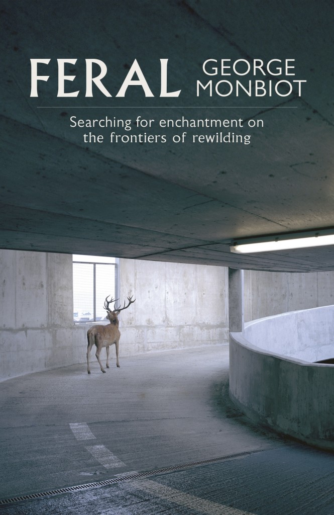
Again, considering our relationship to the land, I have been reading Monbiot's Feral. Some of it is irrelevant to me (and some quite, self-indulgent perhaps...) but a few themes stuck out. I hadn't written about them before, but reflecting on it, it feels more obvious now.
Mostly the idea of rewilding: not preserving nature but letting it take its own course. This would be aided by humans, giving it the best conditions it would need to do this. This relationship with the environment would be to mostly absent. Maybe we are too keen to interfere, or in feeling that we own it, take too much of a hold. For want of a better analogy, like a pushy parent.
There was also a concept that I had forgotten the name of, but was about how our baseline understanding of the environment keeps changing. We believe that the landscape of our childhoods (or even prior) must be the natural untouched one, but its history goes much further than this. For example, I had no idea that moorland is completely unnatural. So this relationship is nostalgia, but also confusion.
Finally, a quote from J.G. Ballard mentioned in the book. "The suburbs dream of violence". Again, an idea I'd had a while back, thinking about engaging with the country as pure ideology, or ambition with no *real* intention. Planned adventure, organised discovery. I'm not sure how to express this in a way that doesn't sound snobbier than I'm thinking it, or proposing that I am any different.
17/04/2017
FMP
Time is passing and, as followed by my earlier notes, I think it makes sense to spend less time on ideas and more actual making. This isn't to necessarily dull down the project, but to not try and do the whole thing when there's only four weeks left.
The overall / before rough concept:


The overall / before rough concept:
- A reflection of our relationship with the British landscape and what may lead people within it to eccentric and/or hermetic lifestyles.
Now, as an introduction to this project, I am proposing to create a series of images based on, perhaps, a more shallow observation of who interacts with the landscape with a less of a "why". That isn't to say that the images would be unthoughtful.
The application -> ?
- series of paintings, or drawings
- (it's a body of visual research)
- an accompanying text?
- exhibition proposal?
- proposed/ made publication?
- to be made into a series of prints?
I'm sure more could be made/ thought of it, but I don't want to apply unnecessarily when this is a project largely done for my own personal gain. Less considering, more doing (right now).
Some imagery I've made so far (prior to these notes), with a focus on image making, and the study of natural surroundings.


12/04/2017
I don't feel that I have been slacking, but I am in a position where little work has been done in response to the "FMP". Rather, I did other big projects and as the FMP is a personal project, I let it go to the side.
I don't see this project as something that will be completed any time soon and I don't want it to be. I see the time I have from now until the module end as a time to begin it, with some sort of intermediate "piece" that would serve to fit module ideals. This could be extended before the graduate show, and would be taken on even further in the future.
This isn't just an excuse for someone with not much time left, but as has been discussed in the studio- this is an opportunity to make something, a beginning, that will sustain us beyond graduation and stop us.... sinking uninspired into the post-grad cesspool. Ideally I WOULD have had a lot of work done by now, but I don't.
10/04/2017
Carmelite: final paintings continued

This is my favourite of the spreads I have done. It's not particularly revolutionary in composition, but I am pleased with the movement within the chickens, and their personalities. I've been worried that I won't be able to make them expressive, or have a wide range of different looking chickens, but I really pushed these, and am glad I did so.

This spread came about when I made a similar version, the "right" way round, but I'm sure I've drawn that composition so many times before. An off-hand comment on just "turning my work upside down" made me literally do that, and I am pleased. It's fun.
I had been struggling with the character of Freddy- how to make him fun, wild and full of expression when in real life a chick is... quite a basic form. This was a problem I had with the hens, but moreso with the simplicity of a chick. Even more than usual, I ignored any rules of *real* reference. Hopefully to good effect.

This is the final of my four completed spreads. It is the one I'm least sure of but has received the most positive attention. Again I'm pleased to have created such variety and expression, but do think that it is technically less admirable than the others... it's less sharp. Due to technical issues I had to make this painting smaller than scale unlike the others, which I think lead to this.
02/04/2017
brief in a day, Stratford Literary Festival
For a laugh (and also because I didn't realise the deadline was so close) I made an entry for the Stratford Literary Festival's competition to design their anthology book cover in a day.
The brief was fairly open, the theme just being "Sharing Stories". Considering the audience, I just wanted to make something simple (nothing too arty or wild). Later on it was brought to my attention that if I had added colour (digitally) to enhance the painting it would make it a little easier to read as an image. I'm also not keen on the texture of the paper still being visible but not consistent within the entire image, and am ashamed to yet again just do what is kind of a rip off of classic Penguin. I need a new, clean simple format that is my own. Regardless, I think the image is sensibly sweet. Some have described it as a little too weird or creepy eyes, but I did want an element of my usual visuals in there.

Still, I like the image in its basic sense, and might re-work it for something, or touch up this design so I can slide it into my portfolio.
This work did not place.
01/04/2017
promotional print
This print needed to cater to a lot of different people, whilst also being decorative enough to potentially hung on a studio wall (ah). I also intended to sell it too, so that was also directive to making something gentle, aesthetically.
I took two things quite tied into my practice:
(Tigers, and wild figured dancers)
To make an image that was cute, but not so silly it wouldn't be too wild to imagine in an editorial or publishing context. The fantasy of it bodes well for children's illustration too. The text directly lends itself to my 1000 Tigers project of my dissertation. There is hope that a bizarre enough saying would intrigue the viewer to look into my other work, and see the correlation with this project.


31/03/2017
Carmelite Prize notes
As I'm finally getting my teeth into the brief beyond just doodling lone chickens... here's some notes I got from tutorials that I really need to remember
- Idiot chickens
- Make them as stupid as possible
- Consider the image as a whole, and how it can extend beyond the narrative presented. Additional things shouldn't be gimmicky, but consider how the parent would discuss the image with a child...
- CONSIDER PACING! Not every spread needs to be wildly exciting, and quieter pages and waves of excitement/ peace will emphasise the mood of it all.
29/03/2017
Andy Goldsworthy
Goldsworthy is maybe not... quite an eccentric (is this because he is labelled as an artist?), but his drive to be at one with nature is compelling. The impermanence of his work is testament and dedication to this, and I wonder if I too, should be so wrapped up in work that is durable. But, I'm not quite ready to pin leaves to tree trunks.
Could my own work have more interaction with the landscape it is feeding off? Exhibit a painting on the top of a hill?
27/03/2017
Carmelite: first spread

This is the first spread I have completed for the Carmelite Prize. It's a tentative step, as I try to figure out the style I would like the entire book to be in. It's a proposal of sorts.
Style notes, things I have been conscious of
- big big forms
- colourful
- texture driven
- daft expressive hens
Going back to earlier notes on adding more to an image, I've introduced the idea of extra panels within the image. Not quite a comic, but something that would suggest the passing of another event or sequence, a window into something external of the image that a parent could talk to with their child about. Here it is the passing of the day and night, and the flowers outside. I'm conscious that this won't happen in every spread (I think this could become quite cluttered), but it is a device that could be used. I'm not so sure of its success yet.
Kick Don't Twist, evaluation
I'm not sure I should upload the whole book online as it is something that's being sold by another party. Here I'll pick out a few notable paintings, and will supply a physical copy for submission.
--
Overall a very positive experience, and I have enjoyed and thrived working on a project that is at once personally driven but also catering to someone else. Feedback has been positive from the client, and I look forward to seeing the response to what is essentially my widest reaching and personal project yet.
The anger, the movement and the propulsion is something I think I have mostly caught. The painting style could have been more inventive, and I do still err on the translation of sketch to painting- something is lost, it gets a little flat, or a little less bold. However, I am pleased with the inventiveness of some figures, and the ones that don't reveal everything, the hidden faces, maybe drawing the viewer in a little closer... Perhaps there could have been more context to this, perhaps more inventiveness BUT! I have made something, of a fairly high quality, that is to be published.


23/03/2017
Hargrave and The Kibbo Kift
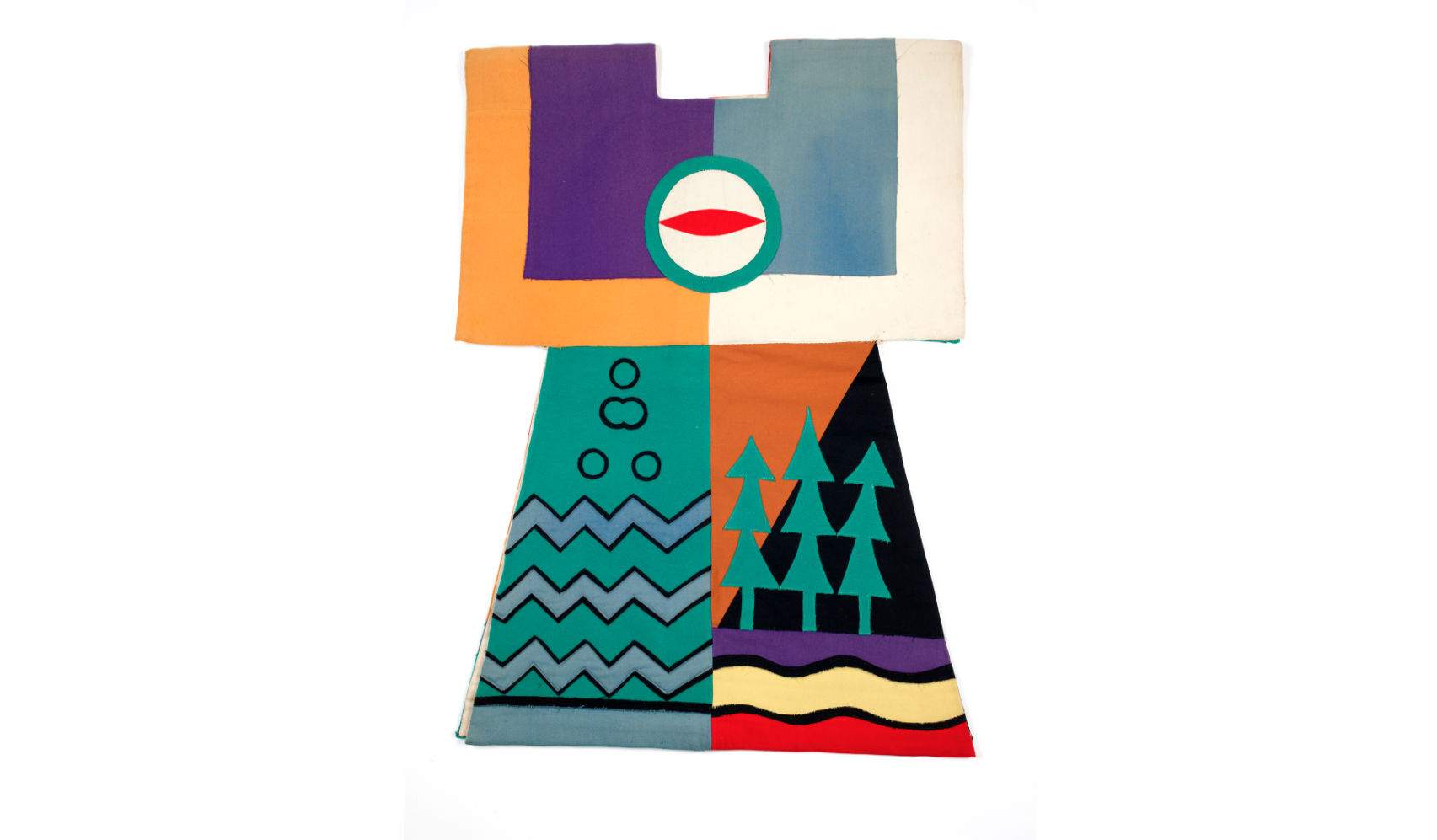
My vague knowledge of the Kibbo Kift (essentially, a 1920s scout movement with more pacifism, spirituality and much more interesting costumes) was what sparked this project. I didn't want to just illustrate their history, but maybe, upon studying their ideas, consider how I would personally reflect visually on the landscape in a similar way.
I have been reading The Kindred of the Kibbo Kift by Anabella Pollen, but haven't gotten through it all yet. So far a lot of the focus has been on the leader, John Hargrave and the reception the group received and I'm yet to read so much about the visual/ spiritual. As I read on, about Hargrave's leadership, it's hard to see the Kibbo Kift and the landscape beyond a stage for Hargrave to project ideas on to. (But stylishly).
Regardless, it's a different way of behaving in the country.


22/03/2017
promotional print
I wrote [here on PPP] why I would like to make an A4 riso print.
I need to consider my methods for making this image. In regards to the content of the image, I feel some pressure as I am trying to boil down as much as I can of what I do into one image that would interest someone into looking into my work further.


I need to consider my methods for making this image. In regards to the content of the image, I feel some pressure as I am trying to boil down as much as I can of what I do into one image that would interest someone into looking into my work further.
- That also brings up the persistent question of : am I doing too much? But I don't want to stop doing *too much* either.
- At the minute I'm quite tied up in working boldly, sometimes messily. Though strange forms and figures are the thing that's keeping my work mostly consistent at the minute, I'm interested in making something a little more delicate...
As to the processes for making the image, I've had a few looks at other prints.
Jean Jullien, printed by Hato: I hadn't considered the translation of brushstrokes into risograph, and it does seem to be quite successful here. My assumption is that his bitmapping was very tight. One colour can work, as long as the values are contrasting.

Sarah McNeil: I'm enjoying the delicate-ness in this. Though painting is quite my thing at the minute, I think it's best when it can be shown for what it is. Through riso it may become a little distorted. Accepting the simplicity of the riso, like McNeil, could be the way forward in regards to the dynamic between line and colour.
I don't necessarily want people to look at it and instantly study the print process. I want the thing that shouts to be my own work!
21/03/2017
promotional print brief
BA (Hons) Illustration - Level 06
OUIL603 Extended
Practice
|
Product
|
Tone of Voice
|
|
One two colour A4 riso print design.
|
Playful, charming
|
|
Audience
|
Context
|
|
Art directors, clients, agencies, studios etc
|
To be sent to art directors, potential clients etc.
|
|
Additional information/Considerations
The image should be decorative enough to go on
a wall as an aesthetic object. But, it must also tailor towards editorial,
publishing and children’s illustration contexts, ideally. Or at least, be
seen as relevant to people in these industries.
|
|
Mandatory Requirements
|
Deliverables
|
|
|
One A4 riso print design
|
Subscribe to:
Comments
(
Atom
)