- Idiot chickens
- Make them as stupid as possible
- Consider the image as a whole, and how it can extend beyond the narrative presented. Additional things shouldn't be gimmicky, but consider how the parent would discuss the image with a child...
- CONSIDER PACING! Not every spread needs to be wildly exciting, and quieter pages and waves of excitement/ peace will emphasise the mood of it all.
31/03/2017
Carmelite Prize notes
As I'm finally getting my teeth into the brief beyond just doodling lone chickens... here's some notes I got from tutorials that I really need to remember
29/03/2017
Andy Goldsworthy
Goldsworthy is maybe not... quite an eccentric (is this because he is labelled as an artist?), but his drive to be at one with nature is compelling. The impermanence of his work is testament and dedication to this, and I wonder if I too, should be so wrapped up in work that is durable. But, I'm not quite ready to pin leaves to tree trunks.
Could my own work have more interaction with the landscape it is feeding off? Exhibit a painting on the top of a hill?
27/03/2017
Carmelite: first spread

This is the first spread I have completed for the Carmelite Prize. It's a tentative step, as I try to figure out the style I would like the entire book to be in. It's a proposal of sorts.
Style notes, things I have been conscious of
- big big forms
- colourful
- texture driven
- daft expressive hens
Going back to earlier notes on adding more to an image, I've introduced the idea of extra panels within the image. Not quite a comic, but something that would suggest the passing of another event or sequence, a window into something external of the image that a parent could talk to with their child about. Here it is the passing of the day and night, and the flowers outside. I'm conscious that this won't happen in every spread (I think this could become quite cluttered), but it is a device that could be used. I'm not so sure of its success yet.
Kick Don't Twist, evaluation
I'm not sure I should upload the whole book online as it is something that's being sold by another party. Here I'll pick out a few notable paintings, and will supply a physical copy for submission.
--
Overall a very positive experience, and I have enjoyed and thrived working on a project that is at once personally driven but also catering to someone else. Feedback has been positive from the client, and I look forward to seeing the response to what is essentially my widest reaching and personal project yet.
The anger, the movement and the propulsion is something I think I have mostly caught. The painting style could have been more inventive, and I do still err on the translation of sketch to painting- something is lost, it gets a little flat, or a little less bold. However, I am pleased with the inventiveness of some figures, and the ones that don't reveal everything, the hidden faces, maybe drawing the viewer in a little closer... Perhaps there could have been more context to this, perhaps more inventiveness BUT! I have made something, of a fairly high quality, that is to be published.


23/03/2017
Hargrave and The Kibbo Kift
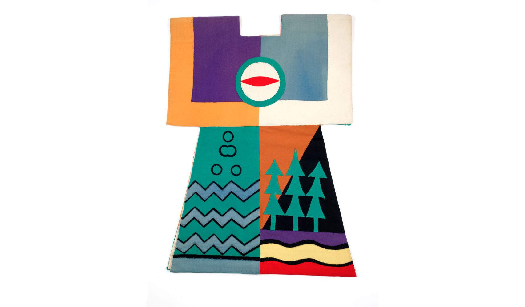
My vague knowledge of the Kibbo Kift (essentially, a 1920s scout movement with more pacifism, spirituality and much more interesting costumes) was what sparked this project. I didn't want to just illustrate their history, but maybe, upon studying their ideas, consider how I would personally reflect visually on the landscape in a similar way.
I have been reading The Kindred of the Kibbo Kift by Anabella Pollen, but haven't gotten through it all yet. So far a lot of the focus has been on the leader, John Hargrave and the reception the group received and I'm yet to read so much about the visual/ spiritual. As I read on, about Hargrave's leadership, it's hard to see the Kibbo Kift and the landscape beyond a stage for Hargrave to project ideas on to. (But stylishly).
Regardless, it's a different way of behaving in the country.


22/03/2017
promotional print
I wrote [here on PPP] why I would like to make an A4 riso print.
I need to consider my methods for making this image. In regards to the content of the image, I feel some pressure as I am trying to boil down as much as I can of what I do into one image that would interest someone into looking into my work further.


I need to consider my methods for making this image. In regards to the content of the image, I feel some pressure as I am trying to boil down as much as I can of what I do into one image that would interest someone into looking into my work further.
- That also brings up the persistent question of : am I doing too much? But I don't want to stop doing *too much* either.
- At the minute I'm quite tied up in working boldly, sometimes messily. Though strange forms and figures are the thing that's keeping my work mostly consistent at the minute, I'm interested in making something a little more delicate...
As to the processes for making the image, I've had a few looks at other prints.
Jean Jullien, printed by Hato: I hadn't considered the translation of brushstrokes into risograph, and it does seem to be quite successful here. My assumption is that his bitmapping was very tight. One colour can work, as long as the values are contrasting.

Sarah McNeil: I'm enjoying the delicate-ness in this. Though painting is quite my thing at the minute, I think it's best when it can be shown for what it is. Through riso it may become a little distorted. Accepting the simplicity of the riso, like McNeil, could be the way forward in regards to the dynamic between line and colour.
I don't necessarily want people to look at it and instantly study the print process. I want the thing that shouts to be my own work!
21/03/2017
promotional print brief
BA (Hons) Illustration - Level 06
OUIL603 Extended
Practice
|
Product
|
Tone of Voice
|
|
One two colour A4 riso print design.
|
Playful, charming
|
|
Audience
|
Context
|
|
Art directors, clients, agencies, studios etc
|
To be sent to art directors, potential clients etc.
|
|
Additional information/Considerations
The image should be decorative enough to go on
a wall as an aesthetic object. But, it must also tailor towards editorial,
publishing and children’s illustration contexts, ideally. Or at least, be
seen as relevant to people in these industries.
|
|
Mandatory Requirements
|
Deliverables
|
|
|
One A4 riso print design
|
05/03/2017
Kick Don't Twist: decision to work spontaneously + style notes
Following the go ahead on this painting being the style of the book, I have decided to work quite spontaneously. I have sketched a few ideas for themes, but find the real gist of an image doesn't come until I sketch it to size. Also conscious of losing the energy of a piece by re-working and re-working, I have decided to work spontaneously on the images.


Style wise, my main priority is to capture movement and feeling through the shapes. However, I am conscious of my painting style becoming quite "paint by numbers" - filling in blocks. I think it works here, and think I should make a conscious note of keeping things simple so it looks purposeful, not just a little empty.
01/03/2017
Shortbox/ Kick Don't Twist correspondence + brief overview
I have been approached by Shortbox to create an 'art object' for their issue #4. An art object would a high quality zine, perhaps. These were the proposals I sent over:
 And the middle concept was picked!

BA (Hons) Illustration - Level 06
OUIL603 Extended
Practice
|
Product
|
Tone of Voice
|
|
20 page art booklet, 26x21cm
|
Angry! Punchy! Fizzing!
|
|
Audience
|
Context
|
|
Shortbox customers, usually those already with an interest in comics
and illustration.
|
Distribution through Shortbox #4, and potentially through my own selling
later.
|
|
Additional information/Considerations
|
|
Mandatory Requirements
|
Deliverables
|
|
|
20 page zine file
|
Subscribe to:
Comments
(
Atom
)