29/01/2017
19/01/2017
chickens
Today I headed for some paint in the hope it would loosen up the chickens.

I enjoy the movement in this sketch, but wonder at what point it gets too weird for a child audience to enjoy. Children's illustration that panders to adult audiences but may not necessarily make sense or be enjoyable to a child is boring. I'm not saying that's particularly true of this, but I'm not sure. But it is why i am wary of abstract visuals.

The lifelessness of the left is smoother, but the image that was drawn with a pencil prior to paint has a better sense of movement. It would make sense to sketch and then use a lightbox to have the best of both these methods.

I enjoy the colouring in this piece, it maintains a fun sensibility but still looks, mostly, finished enough. The shape of the chicken itself, as well as the expression, is bland and flat, and lacks movement. I think the colouring could lend itself to achieving this too, and maybe the tightness detracts from the shaping, but regardless this chicken is lacking in character.
movement in images and reflection on the natural world
As documented in my tigers for COP3 I don't have much regard to realistic anatomy, but there is only so far you can push a creature. I was afraid that I couldn't do much with the form of a chicken, but it turns out they're quite bendy.


18/01/2017
struggles + editorial
I have been really struggling to get back into working after COP3. For the last few days I have been trying to work on editorials and the book covers and making ideas for another project, visually and idea wise it's been running dry. I kept at it, and whilst I always believe in pushing through a project, it's just not very efficient right now when there are other projects I could be trying. Notably- the Carmelite Prize. Right now I want to work on something daft, light hearted. The others will stay on the back burner.
For example, I tried doing a small and quick response for The New Statesman's 'Electric Dreams'. In itself quite a light and nice read, but I don't think the cutesy aesthetic is quite them. EVEN SO, and probably because I drew it at quite a small scale, it is clunky, and clumsy, and the pencil is heavy handed. Working at a larger scale would have made this more delicate, and refined. I think heavy handed can work! But it must be done more purposefully and confidently, to really be 'The Look'. My drawings are lacking in confidence, and if they are not confident they should at least be visually "well crafted".
Although the next couple of weeks calls for some finalising of existing briefs, I think I'm going to draw some chickens.

It's Not Ok- Boston Globe
A lot of time has passed since I was working on this faux-editorial piece. As described before, I did not gauge my time well, or how the series would work together. As time passed I realise that I dislike some of the images that were proposed to be part of the final series, so my final resolution for this article will just be these two images. The two could be used together or on different pages, depending on how the article would be laid out. However, the images alone, and the similarities between them, suggest that there is a character-lead narrative connecting the two. That is not as the article goes.


16/01/2017
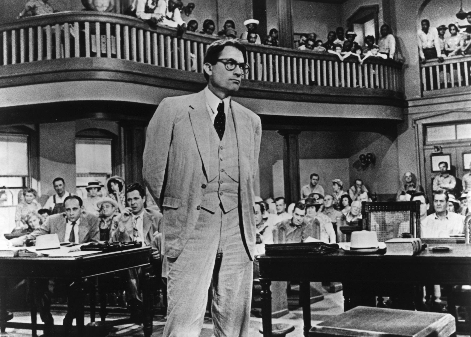
To Kill a Mockingbird- researching without too much influence
Without referring to the film as too much of an influence on my stylistic choices, I have been struggling to really picture the sort of environments and clothing choices that would be accurate to the time period/ location of the book. The courthouse images have been useful, but it was hard to find images of the houses in the film. However, a simple search for 1930s houses in Alabama brought forward what I thought might be accurate. As mentioned in PPP I'd like to work with more 'environment' lead illustrations, I think To Kill a Mockingbird could potentially bring this forward, but there's also a lot of scope for something minimal/ symbolic, or character driven too...

05/01/2017
Carmelite Prize brief
BA (Hons) Illustration - Level 06
OUIL603 Extended
Practice
Product
|
Tone of Voice
|
A dummy book (digital file) of “Free Range Freddy”
|
Fun, colourful, exciting
Child appropriate (nothing that’s accidentally too scary, as some of
my drawings can be for a young audience…)
|
Audience
|
Context
|
Children
Parents
Publishers
|
Competition brief, but the brief is pretty similar to a real book
pitch
This isn’t a final proposal, and if selected there would be editing
etc. But it is still important to get it pretty close to that final point!
|
Additional information/Considerations
SS
|
Mandatory Requirements
|
Deliverables
|
Digital PDF
|
Subscribe to:
Comments
(
Atom
)